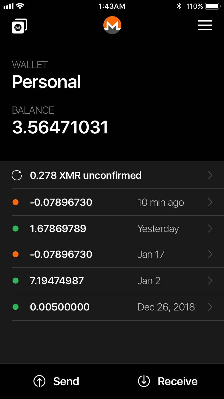
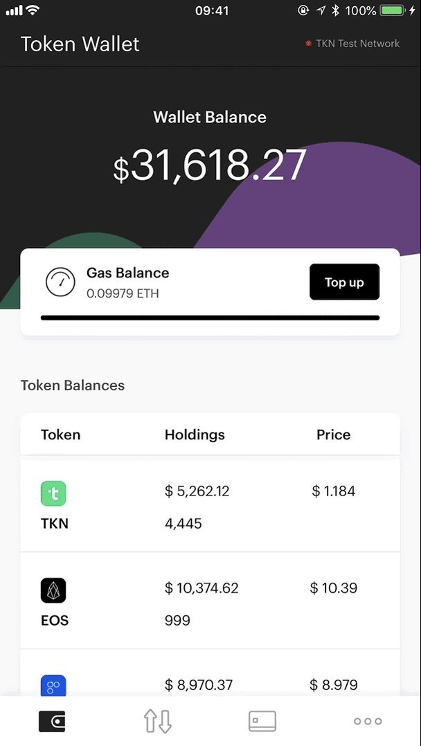
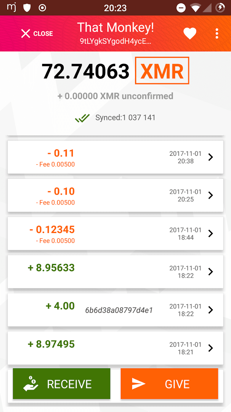
Home screens
The home screen is what repeat users see whenever they launch the wallet. It's tempting to overload it with information for power-users, but that's usually not the right approach.
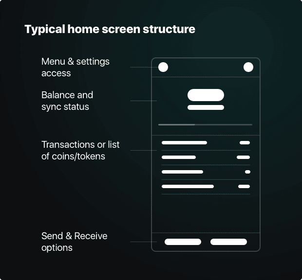
For brand-new and seasoned users alike, the home screen is the central view everyone starts their interactions with usually. At first, it's usually empty, and then it (ideally) starts to fill with information, reflecting the users activity.
Home screens typically use the same basic structure, with minor variations. For transaction lists, see this section.
Before there is activity...
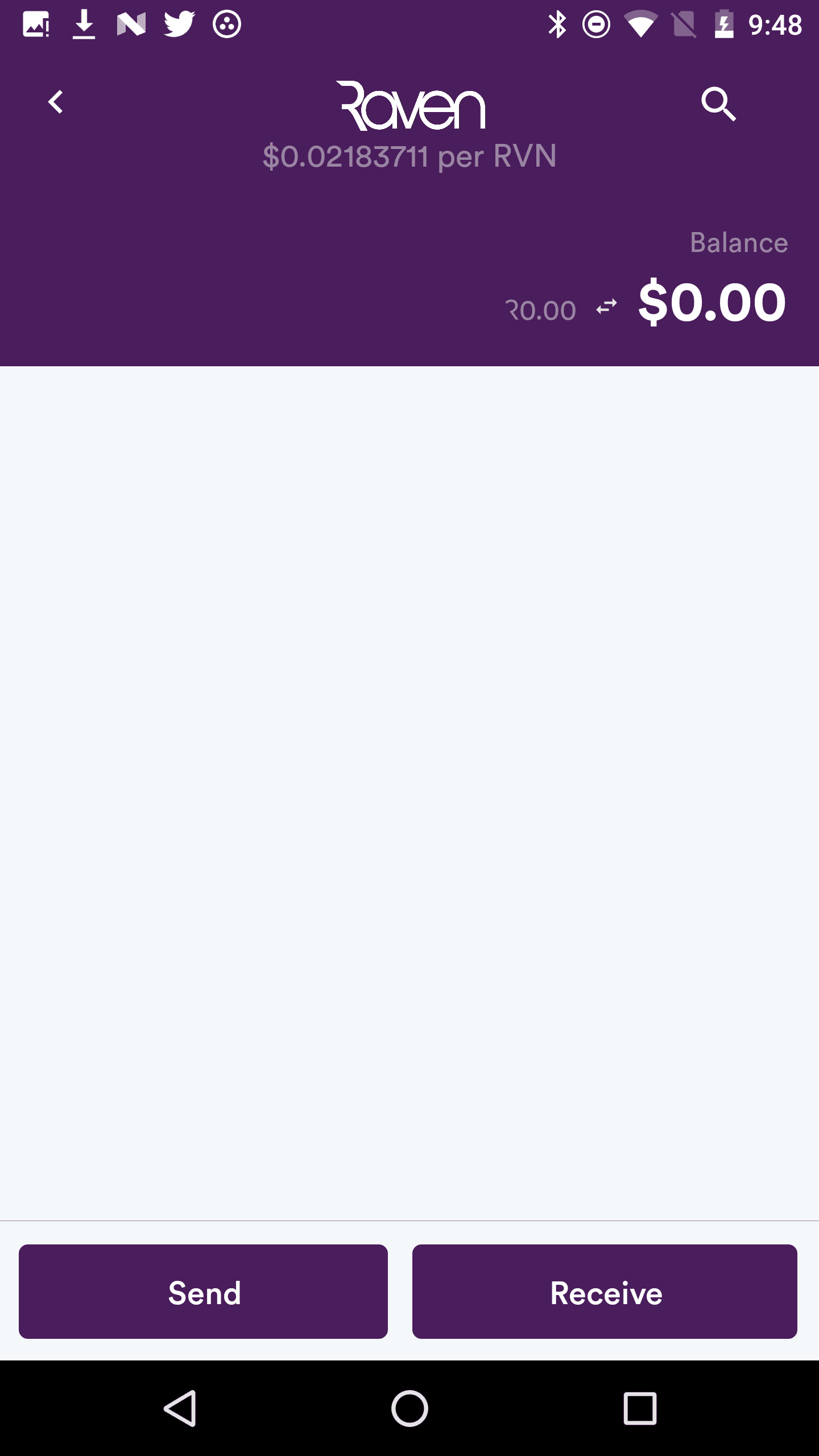
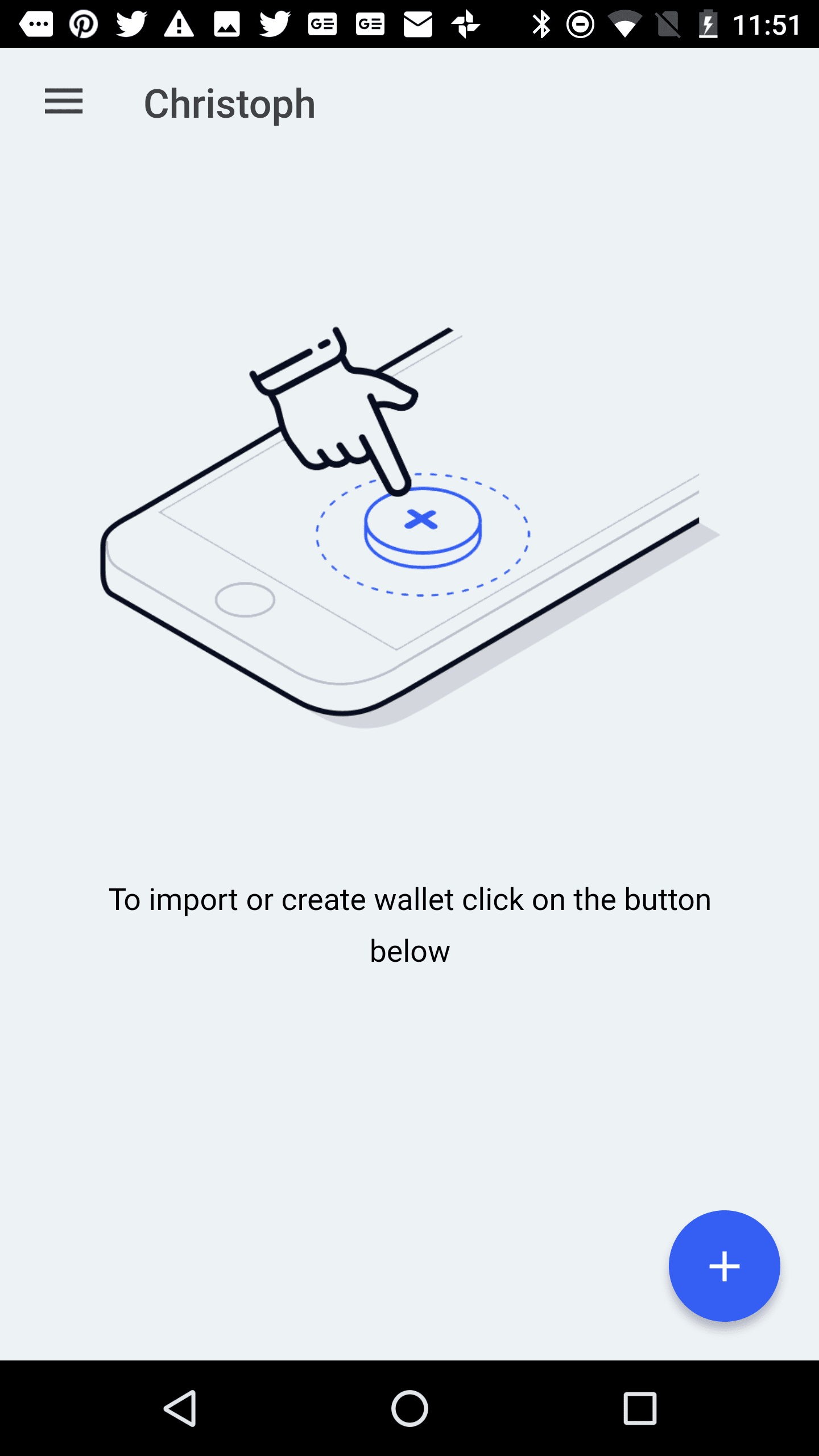
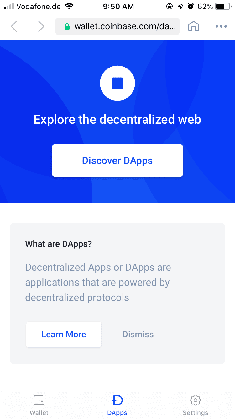
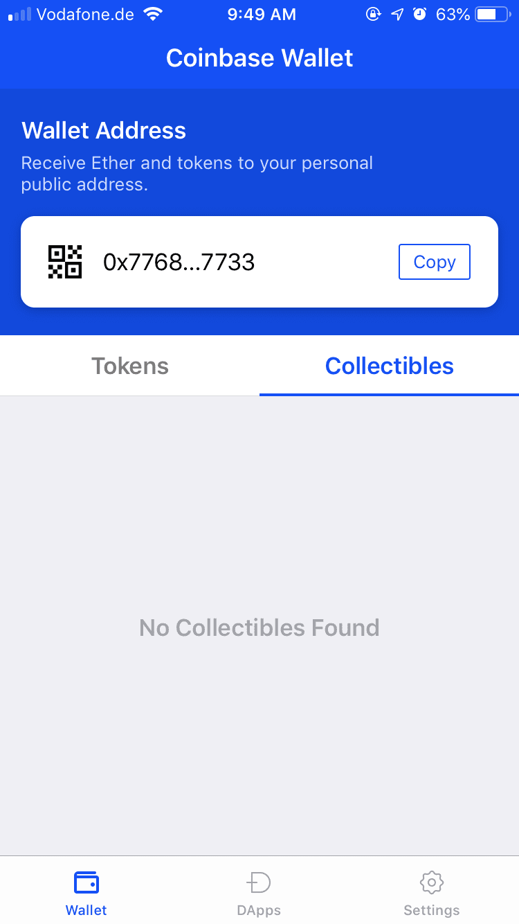
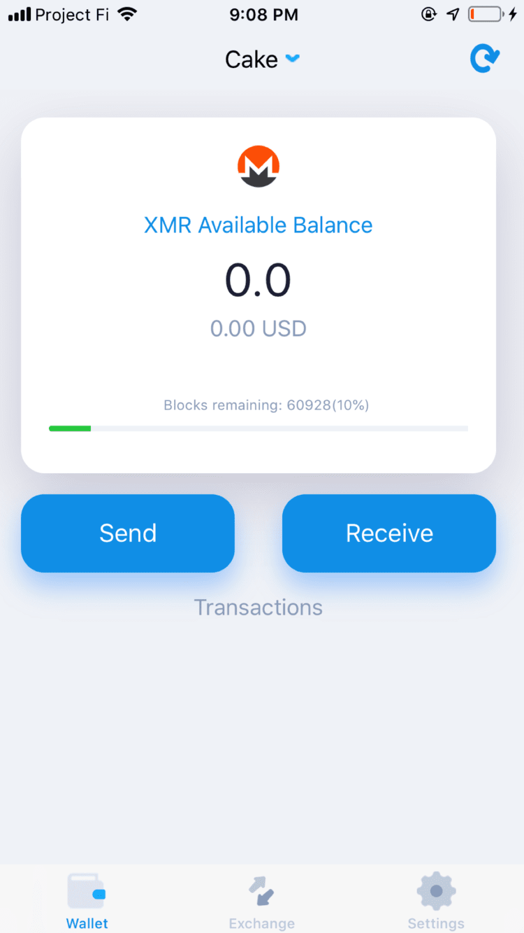
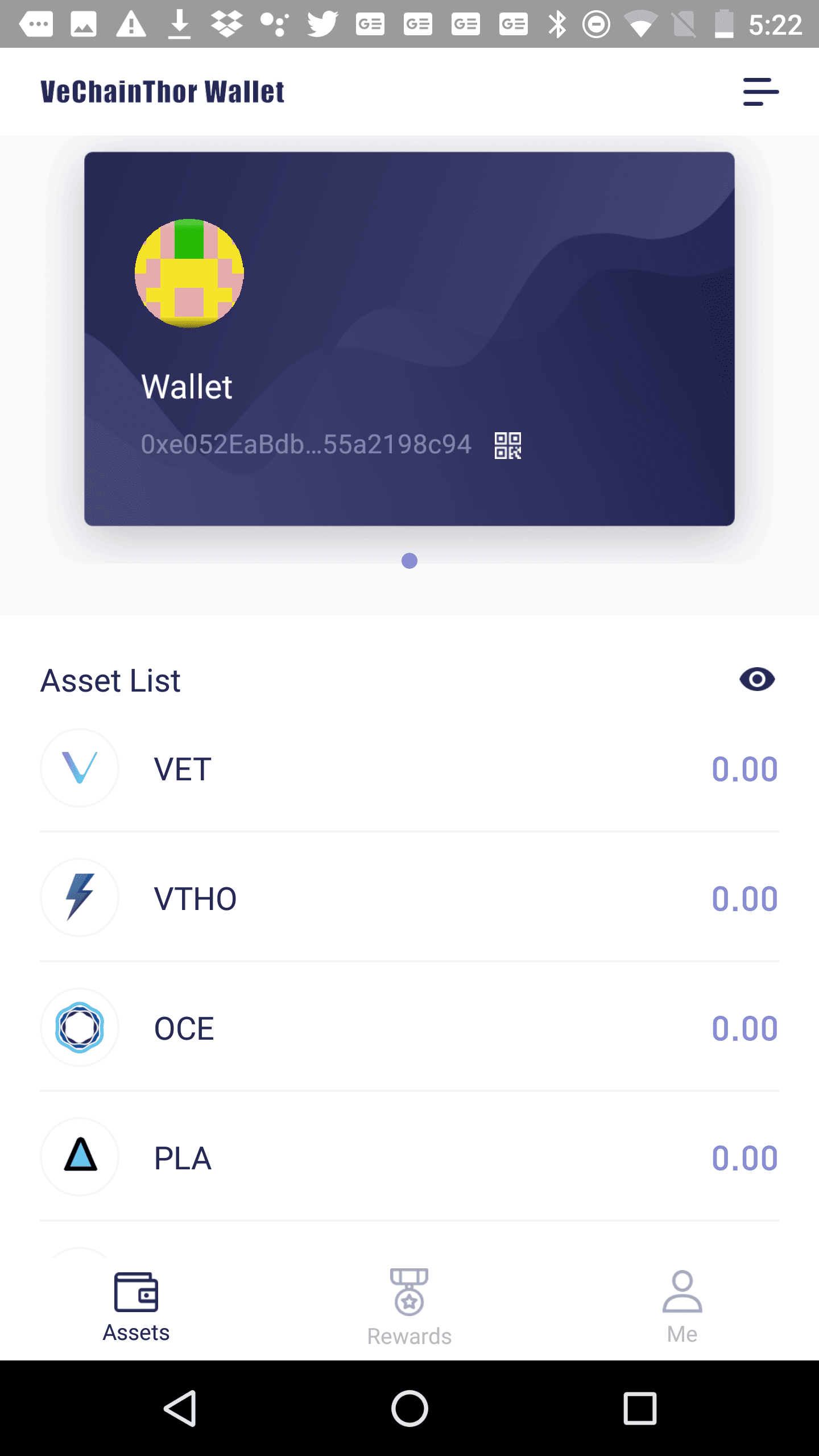
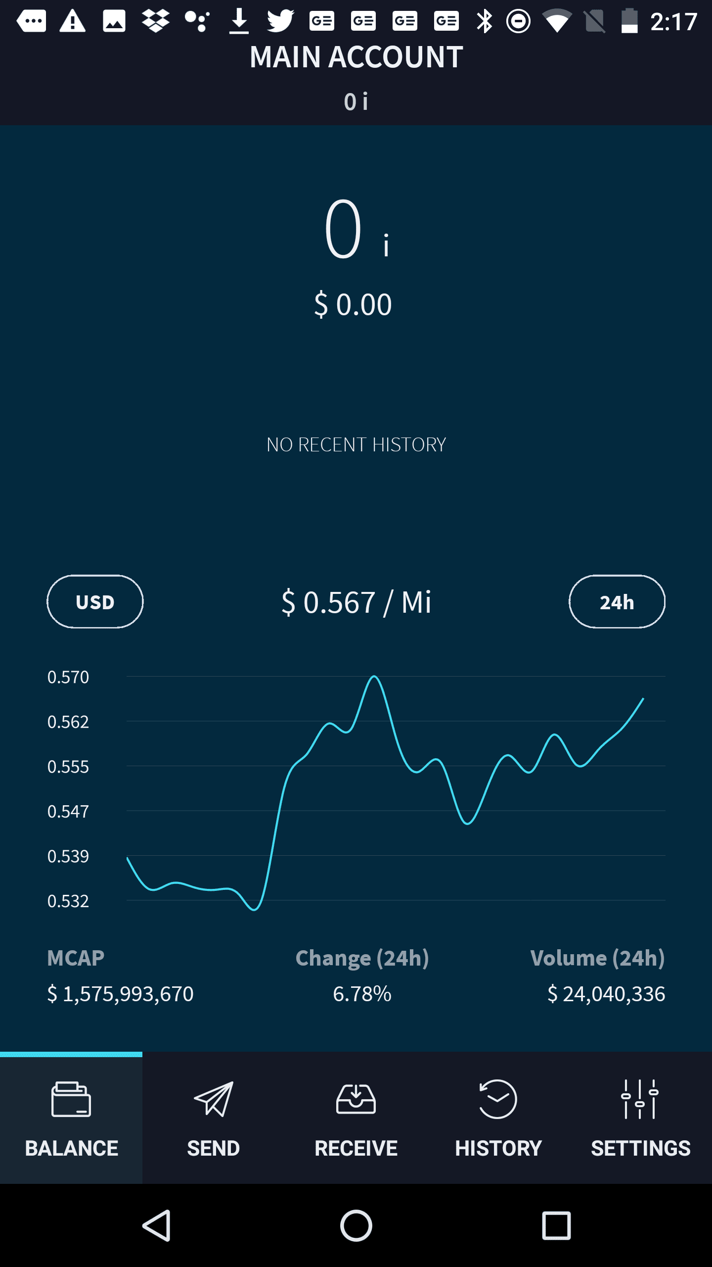
This first part, where there is no or little activity is many times forgotten during design. In those instances, users are many times left with barren screens with little support in getting started. These are often missed opportunities and present good opportunities to get users excited, let them know what the key actions are in the software and help them complete their first activity.
For example, the Ravencoin wallet for Android does a good job at guiding users through the creation of and secure storage of the wallet seed. But then it places users into an empty screen that feels broken because there is no content (no transactions have been made on the new wallet), and no hint at what content could or should be there. A simple message like "Once you make transactions, they will be listed here." would help alleviate this. As with most other wallets, there is no support in making the first transaction, so users need to explore the interface on their own. Read more on home screens.
... and now with activity
Once users have taken some actions, the home screen starts to fill up. After a while, it becomes more important to quickly provide a summary and point out recent changes (such as new transactions the user hasn't seen yet).
